4 Exploration of categorical variables
4.1 Chi-squared tests
The traditional statistical test between two categorical values is the chi^2 test, which compares the actual frequencies of each combination of categorical variables to a perfectly independent frequency (a frequency that would occur if each combination had the same ratio as the overall ratio for one variable). The null hypothesis for the chi^2 test is that there is no relationship between the variables.
I use a set of helper functions to iterate over the different categorical variables and then summarize the results in tables.
my_chisq_test <- function(var1, var2) { # Test and extract Chi^2 statistics
  res <- rstatix::chisq_test(x = var1, y = var2)
  ex_res <- c(chi = res$statistic, pval = res$p)
  return(ex_res)
}

chi_sqr_res <- train4 %>%
  select(HomePlanet, Destination, Deck, Side, CryoSleep, VIP, LastName) %>%
  summarise(chi_stats = map(.x = across(everything()), .f = \(x) map(.x = across(everything()), .f = \(y) my_chisq_test(x, y))))

chi_sqr_res2 <- chi_sqr_res %>%
  unnest() %>%
  unnest_wider(col = everything()) %>%
  rename(chi_sqr = `chi.X-squared`, p_value = pval) %>%
  bind_cols(expand.grid(Var1 = c("HomePlanet", "Destination", "Deck", "Side", "CryoSleep", "VIP", "LastName"),
                        Var2 = c("HomePlanet", "Destination", "Deck", "Side", "CryoSleep", "VIP", "LastName")), .)

chi_sqr_res2 %>%
  select(Var1, Var2, chi_sqr, p_value) %>%
  filter(p_value > 0.05 & Var1 != Var2) %>%
  distinct(chi_sqr, .keep_all = TRUE) %>%
  arrange(as.character(Var1), desc(p_value))
#>        Var1        Var2   chi_sqr p_value
#> 1 CryoSleep        Side 3.7837832  0.0518
#> 2      Side Destination 1.5379546  0.4630
#> 3       VIP        Side 0.5181925  0.4720
If we use the typical 95% confidence interval as a cut-off point for comparison, we can see that three pairs of variables have p-values higher than 5%, which means that these variables are independent of each other. All of these pairs involve the Side feature which perhaps suggests that people with VIP tickets or in cryo sleep weren’t clustered on one side of the ship, as well as people travelling to a certain destination.
This very simple comparison might suggest that there could be possible interactions effects between the other variables that we should consider. Let’s visualise how the variables are related to each other.
4.2 Mosaic plots
Here I use a custom function from Kuhn’s and Johnsson’s code to improve the default mosaic plot and plot the categorical variables against each other with the help of contigency tables for each pair. I’ve left out LastName since it has too many levels.
my_mosaic <- function(dtab, i) {
  png(filename = paste0("Extra/Mosaic", i, ".png"))
  vcd::mosaic(dtab, pop = FALSE, highlighting = TRUE, highlighting_fill = colorspace::rainbow_hcl,
            margins = unit(c(6, 1, 1, 8), "lines"),
            labeling = vcd::labeling_border(rot_labels = c(90, 0, 0, 0), just_labels = c("left", "right", "center", "right"),
                                       offset_varnames = unit(c(3, 1, 1, 4), "lines")), keep_aspect_ratio = FALSE)
  dev.off()
}

my_tables <- list(
  base::table(HomePlanet = train4$HomePlanet, Destination = train4$Destination),
  base::table(HomePlanet = train4$HomePlanet, CryoSleep = train4$CryoSleep),
  base::table(HomePlanet = train4$HomePlanet, Deck = train4$Deck),
  base::table(HomePlanet = train4$HomePlanet, Side = train4$Side),
  base::table(HomePlanet = train4$HomePlanet, VIP = train4$VIP),

  base::table(Destination = train4$Destination, CryoSleep = train4$CryoSleep),
  base::table(Destination = train4$Destination, Deck = train4$Deck),
  base::table(Destination = train4$Destination, Side = train4$Side),
  base::table(Destination = train4$Destination, VIP = train4$VIP),

  base::table(CryoSleep = train4$CryoSleep, Deck = train4$Deck),
  base::table(CryoSleep = train4$CryoSleep, Side = train4$Side),
  base::table(CryoSleep = train4$CryoSleep, VIP = train4$VIP),

  base::table(Deck = train4$Deck, Side = train4$Side),
  base::table(Deck = train4$Deck, VIP = train4$VIP),

  base::table(Side = train4$Side, VIP = train4$VIP)
)

# mosaic_plots <- map2(.x = my_tables, .y = 1:length(my_tables), .f = \(t, it) my_mosaic(dtab = t, i = it))
# mosaic_slick <- map(1:length(mosaic_plots), .f = \(i) paste0("Extra/Mosaic", i, ".png"))
# save(mosaic_slick, file = "Extra/Mosaic slick plots.RData")

load("Extra/Mosaic slick plots.RData")
slickR::slickR(mosaic_slick, height = "480px", width = "672px") +
  slickR::settings(slidesToShow = 1, dots = TRUE)
Figure 4.1: Mosaic plots to visualize the relationships between categorical variables
The mosaic plot can be read from horisontally where we can see how the height of the bars changes with different (vertical) values of the other variable. For example, we see how the share of passengers that are in cryosleep changes with the deck and we know from the Chi^2 test that the change is significant.
We can return to this visual understanding of the relationship between the categorical variables whenever we want to check if some relationship metric makes sense. For example, we can see that the differences between Side and some of the variables that didn’t fall outside the 5% p-value, like HomePlanet, seem relatively small.
4.3 Correspondence Analysis
Correspondence analysis uses the residuals from the contingency table of two variables compared to the frequency table the variables would’ve had if they were unrelated to each other. Figure 4.2 shows the correspondence analysis between Destination and Deck.
plot(FactoMineR::CA(base::table(Deck = train4$Deck, Destination = train4$Destination), graph = FALSE),
     title = "Destination and Deck")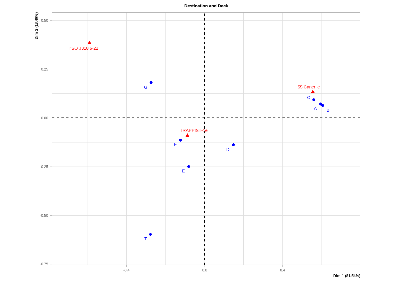
Figure 4.2: Correspondance analysis of Destination and Deck variables.
The way to read this plot is as follows:
The horizontal and vertical components show the amount of the Chi^2 statistic that each respective component accounts for. Another way to think of this is what amount of information from the original variables is explained by either the horizontal or vertical direction. The eigenvalues inside the parenthesis gives us a sense of which component is more important. For example, the horizontal axis is much more important in both our cases.
The distance from the origin in either direction tells us how rare the particular category is. For example, Deck T has only five passengers so it’s very rare.
Categories from the same variable that are close together (particularly along the horizontal axis in our case) suggest similarities between the categories. For example, decks A-C seem to have a similar variation.
Categories from different variables that are close together suggest a dependence and especially if the distance from the origin is large. A trick to see the strength of the relationship is to imagine a straight line from one category to the orgin and then to the other category. The greater the distance and the smaller the angle, the stronger the relationship. For example, if we draw a line from deck A to the origin and then to Cancri, we get a relatively long line and a tiny angle.
We can check if these insights make sense in our mosaic plot above. For example, decks A-C do seem to an unusually high proportion of passengers that travel to Cancri while decks D-G do seem to be more common for travellers to Trappist although the relationship is more moderate.
plot(FactoMineR::CA(base::table(Deck = train4$Deck, HomePlanet = train4$HomePlanet), graph = FALSE),
     title = "HomePlanet and Deck")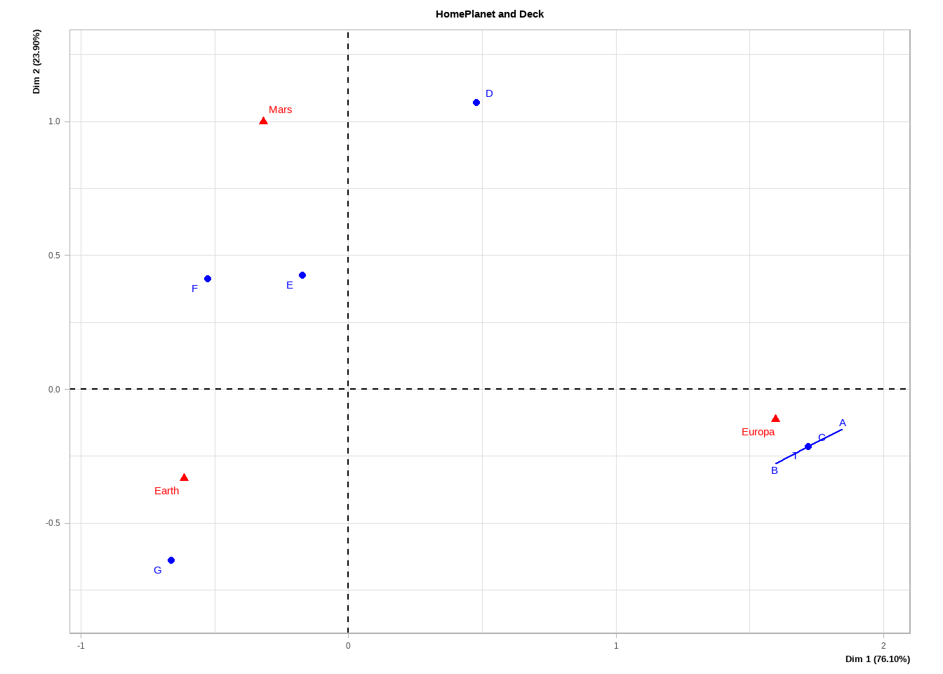
Figure 4.3: Correspondance analysis of HomePlanet and Deck variables.
For HomePlanet and Deck, we see a strong relationship between Europa and decks A-C as well as Earth and deck G. It might make sense to create a feature where decks A-C are pooled into a single category to potentially reduce the noise in our data.
4.4 Relationships between categorical variables and the outcome
So far, we’ve only looked at relationships between the categorical predictors but not how they are related to the response. We can explore this with a binomial proportion test (the code is heavily borrowed from Kuhn and Johnson). This is in a sense similar to the chi^2 test in that it compares the actual proportions within a group to some given or expected proportion, in this case the proportion of those that were transported from the total number of passengers.
response_rate = mean(train4$Transported == "True")

my_binom <- function(df, t) { # Test whether the differences in proportions (of transported) are significant
  p <- infer::prop_test(x = df, response = !!sym(t))
  df2 <- df %>%
    mutate(Lower = p$lower_ci,
           Upper = p$upper_ci,
           Proportion = sum(!!sym(t) == "True") / length(!!sym(t)))
  return(df2)
}

my_binom_plot <- function(df, v, t) { # Applies the proportion test to different categories of a variable and plots the results
  p <- df %>%
    group_split(!!sym(v)) %>%
    map(.x = ., .f = \(df) my_binom(df, t)) %>%
    bind_rows() %>%
    mutate(my_var = reorder(!!sym(v), Proportion)) %>%
    ggplot(., aes(x = my_var, y = Proportion)) +
    geom_errorbar(aes(ymin = 1 - Lower, ymax = 1 - Upper), width = .1) +
    geom_point() +
    geom_hline(yintercept = response_rate, col = "red", alpha = .8, lty = 4) +
    scale_y_continuous(breaks = seq(0, 1, 0.1), limits = c(0, 1)) +
    labs(x = "", title = v)

  return(p)
}
save_plot <- function(p, i) {
  ggsave(filename = paste0("Extra/Binomial", i, ".png"), plot = p)
}

binom_plots <- train4 %>%
  select(where(is.character), where(is.factor)) %>%
  summarise(across(.cols = -c(Cabin, Name, LastName, PassengerId, Transported, PassengerGroup), .fns = list)) %>%
  imap(.f = ~my_binom_plot(train4, .y, "Transported"))

# binom_plots2 <- walk2(.x = binom_plots, .y = seq_along(binom_plots), .f = save_plot)
# binom_slick <- map(1:length(binom_plots), .f = \(i) paste0("Extra/Binomial", i, ".png"))
# save(binom_slick, file = "Extra/Biomial slick plots.RData")

load("Extra/Biomial slick plots.RData")
slickR::slickR(binom_slick, height = "480px", width = "672px") +
  slickR::settings(slidesToShow = 1, dots = TRUE)
Figure 4.4: All categorical variables plotted as a binomial plots with confidence intervals. The red dotted line shows the average probability of the response across the entire training set.
We see a lot of interesting details so let us focus on a few of our features that relate to the passenger group.
my_binom_plot(train4, "PassengerGroupSize", "Transported")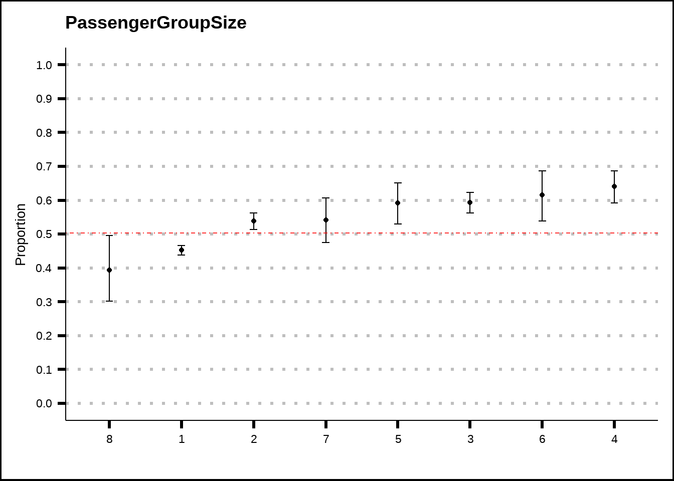
Figure 4.5: PassengerGroupSize plotted as a binomial plot with confidence intervals. The red dotted line shows the average probability of the response across the entire training set.
Figure 4.5 suggests that there might be a difference between passengers who travel alone and those who don’t. Perhaps a binary feature that tracks whether a passenger travels solo or is within a group could be of benefit. Also, perhaps very large groups are less likely to be transported, although we don’t have much data here.
my_binom_plot(train4, "DestinationsPerGroup", "Transported")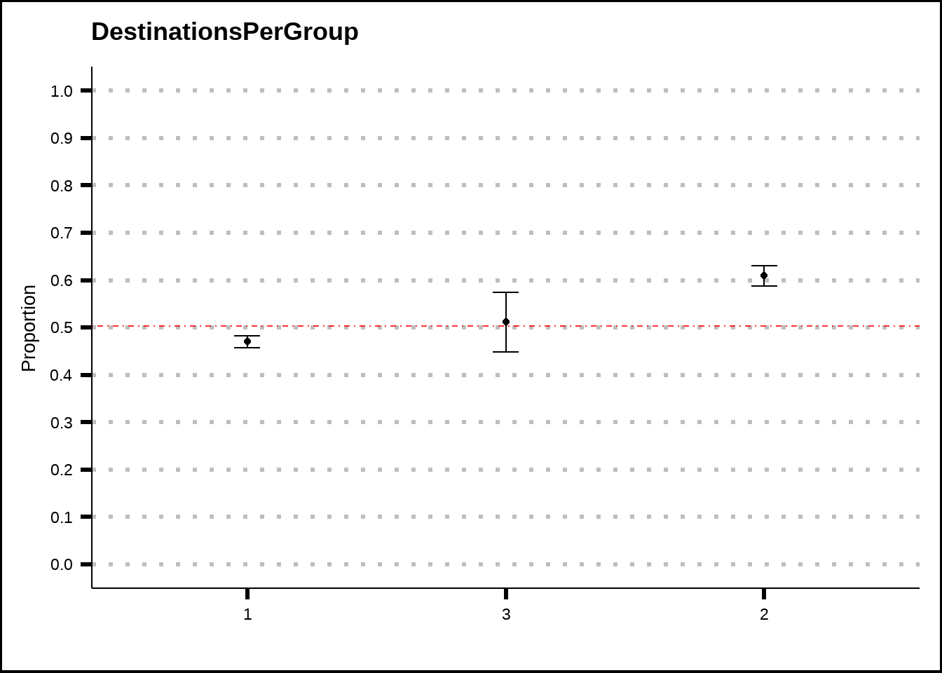
Figure 4.6: DestinationsPerGroup plotted as a binomial plot with confidence intervals. The red dotted line shows the average probability of the response across the entire training set.
Figure 4.6 suggests that there might be some slight difference between groups of passengers that all travelled to the same destination and those that didn’t. While the differences are small, the presence of this feature might improve some models.
Let’s create a function that will add the new features we’ve discovered to our data.
add_grp_features <- function(df) {
  res <- df %>%
  mutate(Solo = if_else(PassengerGroupSize == 1, 1, 0),
         LargeGroup = if_else(as.integer(PassengerGroupSize) > 7, 1, 0),
         TravelTogether = if_else(DestinationsPerGroup == 1, 1, 0))
}

train5 <- add_grp_features(train4)
Let’s explore the VIP variables a bit more. Figure 4.7 suggests that the chances of being transported are higher for passengers who are in a group where another passenger has a VIP ticket at the same time as having a VIP ticket by itself seems to reduce the chance of being transported.
v1 <- my_binom_plot(train5, "VIP", "Transported")
v2 <- my_binom_plot(train5, "VIPsPerGroup", "Transported")

v1 + v2 + plot_layout(axis_titles = "collect_y")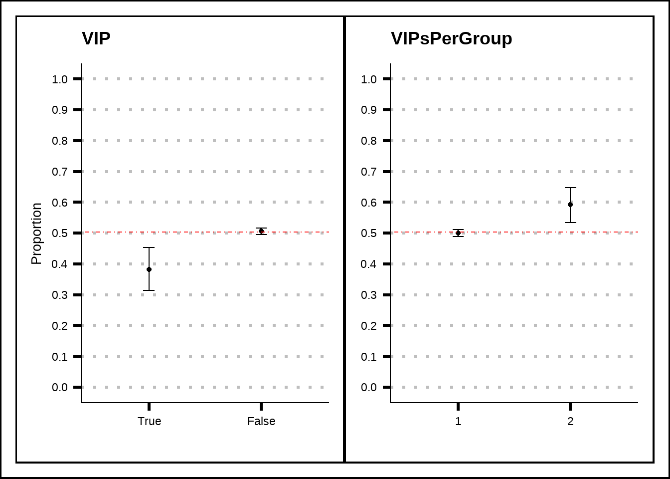
Figure 4.7: A closer look at the VIP variable and its relation to the response.
Based on what we can see in Figure 4.8, the passengers that are in groups where more than one passenger has a VIP-ticket are more likely to be transported. This can be related to the fact that VIP-passengers spend more amenities which, in turn, might increase the chances of being transported.
We will explore the effects of the numerical variables in the next chapter.
g1 <- train5 %>%
  select(VIP, Transported, VIPsPerGroup) %>%
  filter(VIPsPerGroup == 2) %>%
  ggplot(., mapping = aes(x = VIP, fill = Transported)) +
  geom_bar() +
  geom_text(aes(by = VIP), stat = "prop", position = position_stack(vjust = 0.5)) +
  facet_wrap(~VIPsPerGroup, labeller = "label_both") +
  labs(title = "Two VIPsPerGroup", x = "VIP", y = "Number of passengers") +
  theme(axis.text.x = element_text(angle = 90, hjust = 1), text = element_text(size = 10), plot.title = element_text(size = 10))

g2 <- train5 %>%
  select(VIP, Transported) %>%
  ggplot(., mapping = aes(x = VIP, fill = Transported)) +
  geom_bar() +
  geom_text(aes(by = VIP), stat = "prop", position = position_stack(vjust = 0.5)) +
  labs(title = "VIP share total", x = "VIP", y = "Number of passengers") +
  theme(axis.text.x = element_text(angle = 90, hjust = 1), text = element_text(size = 10), plot.title = element_text(size = 10))

(g1 + g2) +
  plot_layout(guides = "collect", axis_titles = "collect")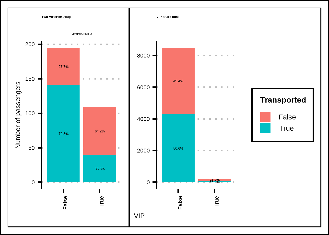
Figure 4.8: A closer look at VIP and VIPsPerGroup against the response.