5 Exploration of numerical variables
We now turn to our numerical variables to see how they affect the response.
5.1 Name variable
First, let’s transform the name variable into numerical values. We can assume that there is no rank order of the names based on the fact that the variable distribution is uniform (see Figure 2.1). Here I use a very simple encoding to convert the names into numbers.
encode_cat_to_numeric <- function(x) {
  x <- factor(x, ordered = FALSE)
  x <- unclass(x)
  return(x)
}

add_name_features <- function(df) {
  res <- df %>%
  mutate(LastNameAsNumber = encode_cat_to_numeric(LastName)) %>%
  add_count(x = ., LastNameAsNumber, name = "LastNameCount") %>%
  mutate(across(.cols = c(PassengerGroup, LastNameAsNumber), .fns = as.integer))
}

train6 <- add_name_features(train5)
Let’s also explore our count values for names visually to see how they look against the response.
df1 <- train6 %>%
  select(Transported, LastNamesPerGroup) %>%
  group_by(LastNamesPerGroup, Transported) %>%
  summarise(count = n()) %>%
  mutate(perc = count / sum(count))

g1 <- ggplot(data = df1) +
  geom_bar(aes(x = LastNamesPerGroup, y = perc*100, fill = Transported), stat = "identity") +
  labs(y = "Percent transported")

df2 <- train6 %>%
  select(Transported, LastNameCount) %>%
  group_by(LastNameCount, Transported) %>%
  summarise(count = n()) %>%
  mutate(perc = count / sum(count))

g2 <- ggplot(data = df2) +
  geom_bar(aes(x = LastNameCount, y = perc*100, fill = Transported), stat = "identity") +
  labs(y = "Percent transported")

g1 + g2 + plot_layout(guides = "collect", axis_titles = "collect_y")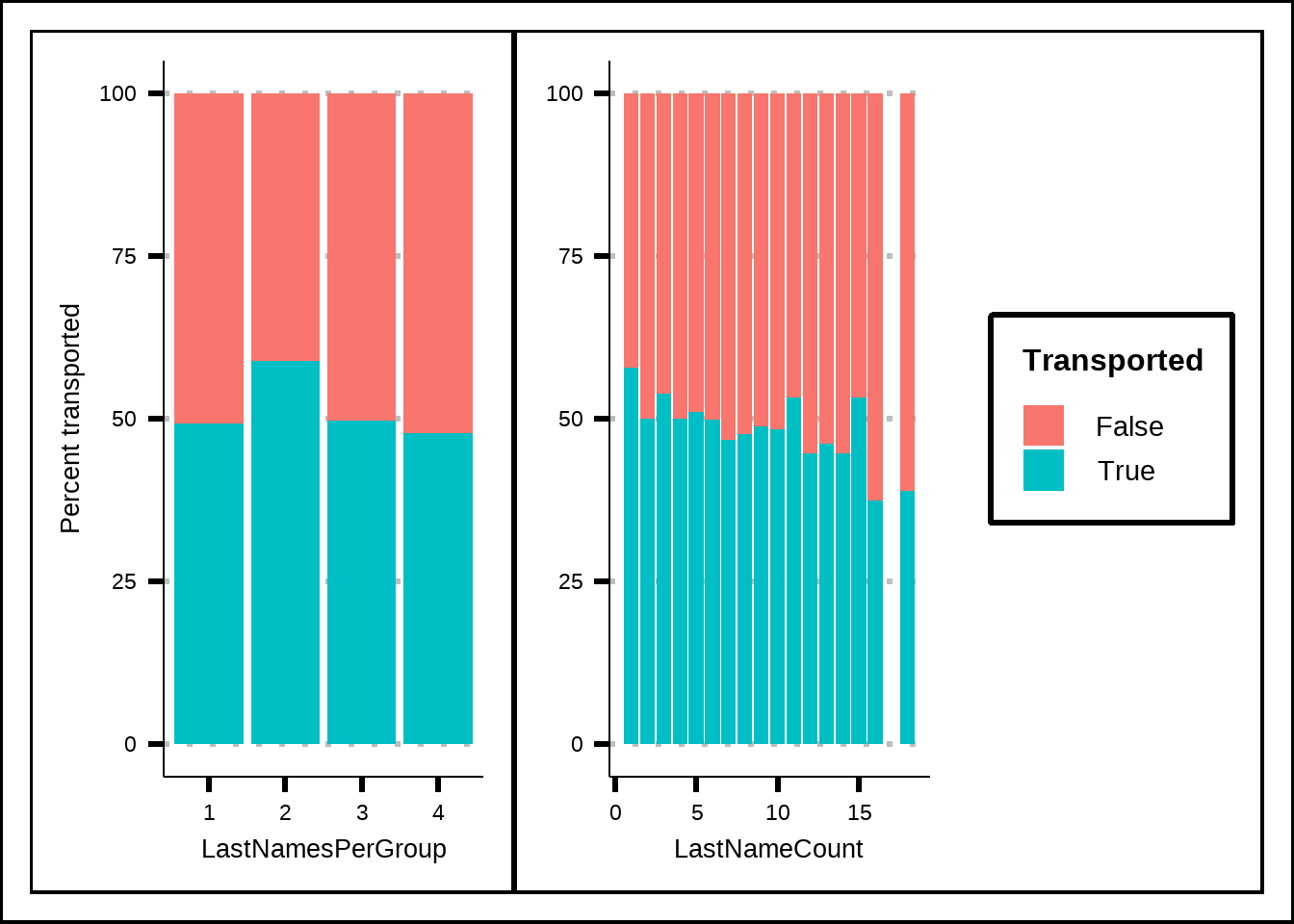
Figure 5.1: Exploration of the counts of the LastName variable where LastNameCount is the number of passengers in total that share the same last name while LastNamesPerGroup is the number of passengers that share last name within a group.
There does seem to be some difference which is good news since it allows us to get some use of the name variable that in its original form didn’t seem to have much variance. Hopefully these features will prove to be beneficial.
5.2 Age, CabinNumber and LastNames
Kuhn and Johnson propose a smoothing function using generalized additive models that use penalized regression to create smoothing for numeric variables against the response. I’ve modified their function somewhat.
my_smooth_plot <- function(d, v) {
  TransportedRate <- mean(d$Transported == "True")

  my_df <- d %>%
    select(!!sym(v), Transported) %>%
    arrange(!!sym(v))

  my_df_small <- my_df %>%
    distinct(!!sym(v))

  gam_model <- mgcv::gam(as.formula(paste("Transported", "~ s(", v, ")")), data = my_df, family = binomial())

  my_df_small <- my_df_small %>%
    mutate(
      link = predict(gam_model, my_df_small, type = "link"),
      se = predict(gam_model, my_df_small, type = "link", se.fit = TRUE)$se.fit,
      upper = link + qnorm(.975) * se,
      lower = link - qnorm(.975) * se,
      lower = binomial()$linkinv(lower),
      upper = binomial()$linkinv(upper),
      probability = binomial()$linkinv(link)
    )

  g <- ggplot(my_df_small, aes(x = !!sym(v))) +
        geom_line(aes(y = probability)) +
        geom_ribbon(aes(ymin = lower, ymax = upper), fill = "grey", alpha = .5) +
        geom_hline(yintercept = TransportedRate, col = "red", alpha = .8, lty = 4)  +
        scale_y_continuous(breaks = seq(0, 1, 0.1), limits = c(0, 1)) +
        labs(x = v, title = paste("Smoothed", v))

  return(g)
}

my_smooth_plot(train6, "Age")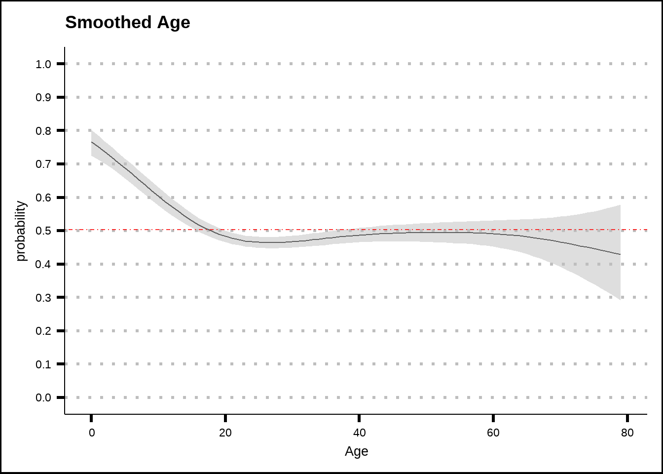
Figure 5.2: General additive model (GAM) plots for Age with smoothed confidence intervals. The red dotted line shows the average probability of the response across the entire training set.
Passengers younger that 15 years of age seem to have a higher chance to be transported, with the effect being more significant the younger the passenger is. For the rest of the passengers, age doesn’t seem to matter much. Here we remember that passengers who were 12 years old or younger never spent credits on amenities so the real divide might be at that number, rather than at 15. We’ll remember this when we consider which features we might want to create.
my_smooth_plot(train6, "PassengerGroup")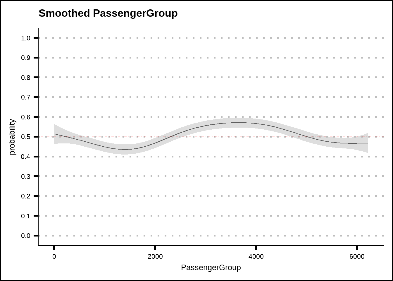
Figure 5.3: General additive model (GAM) plots for PassengerGroup with smoothed confidence intervals. The red dotted line shows the average probability of the response across the entire training set.
Passenger groups seem to have some effect but it’s limited.
my_smooth_plot(train6, "CabinNumber")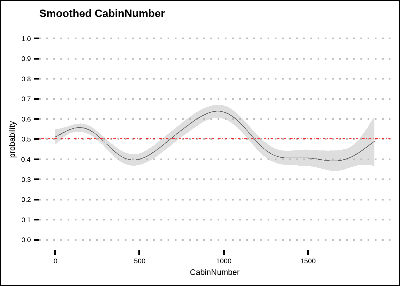
Figure 5.4: General additive model (GAM) plots for CabinNumber with smoothed confidence intervals. The red dotted line shows the average probability of the response across the entire training set.
CabinNumber shows stronger effects than passengergroup. If we look closer at the cabins around the number 1000, we see that all of those cabins are in decks F and G. If we look back at Figure 4.4 that shows Deck against the response, we can see that these decks show a smaller chance to be transported. This might suggest that the addition of the cabin number could provide a way for the models to find subgroups with a different response compared to the average for the decks.
my_smooth_plot(train6, "LastNameAsNumber")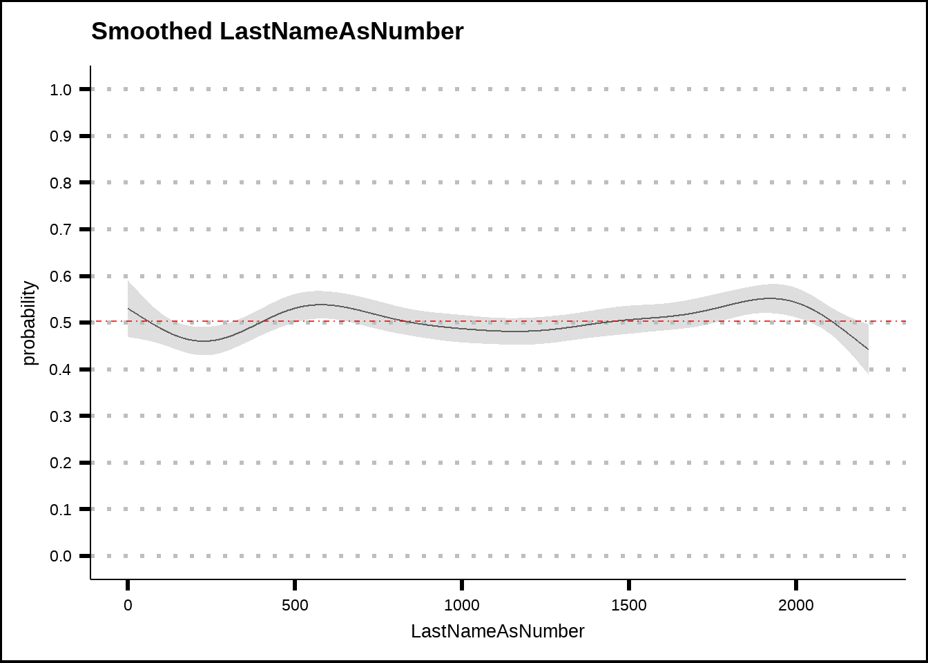
Figure 5.5: General additive model (GAM) plots for LastNameAsNumber with smoothed confidence intervals. The red dotted line shows the average probability of the response across the entire training set.
Perhaps not a surprise but LastName has no effect. Remember, however, that counts of last names as we saw in Figure 5.1 might provide useful information.
5.3 Amenities
The amenity variables that are zero might reflect the fact that the passenger is in cryosleep so let’s filter that out before we plot them.
s1 <- my_smooth_plot(train6 %>% filter(CryoSleep == "False"), "RoomService")
s2 <- my_smooth_plot(train6 %>% filter(CryoSleep == "False"), "Spa")
s3 <- my_smooth_plot(train6 %>% filter(CryoSleep == "False"), "VRDeck")

s1 + s2 + s3 + plot_layout(axis_titles = "collect_y")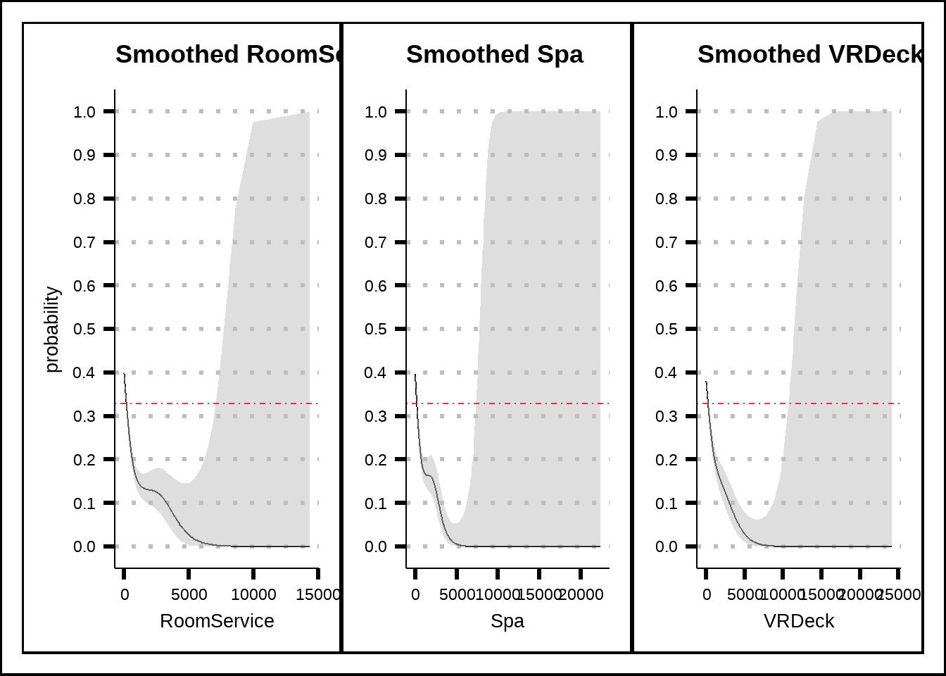
Figure 5.6: General additive model (GAM) plots for RoomService, Spa and VRDeck with smoothed confidence intervals. The red dotted line shows the average probability of the response across the entire training set.
Passengers who spent credits on RoomService, Spa and VRDeck seem to have been less likely to be transported and the effects seem large.
s4 <- my_smooth_plot(train6 %>% filter(CryoSleep == "False"), "FoodCourt")
s5 <- my_smooth_plot(train6 %>% filter(CryoSleep == "False"), "ShoppingMall")

s4 + s5 + plot_layout(axis_titles = "collect_y")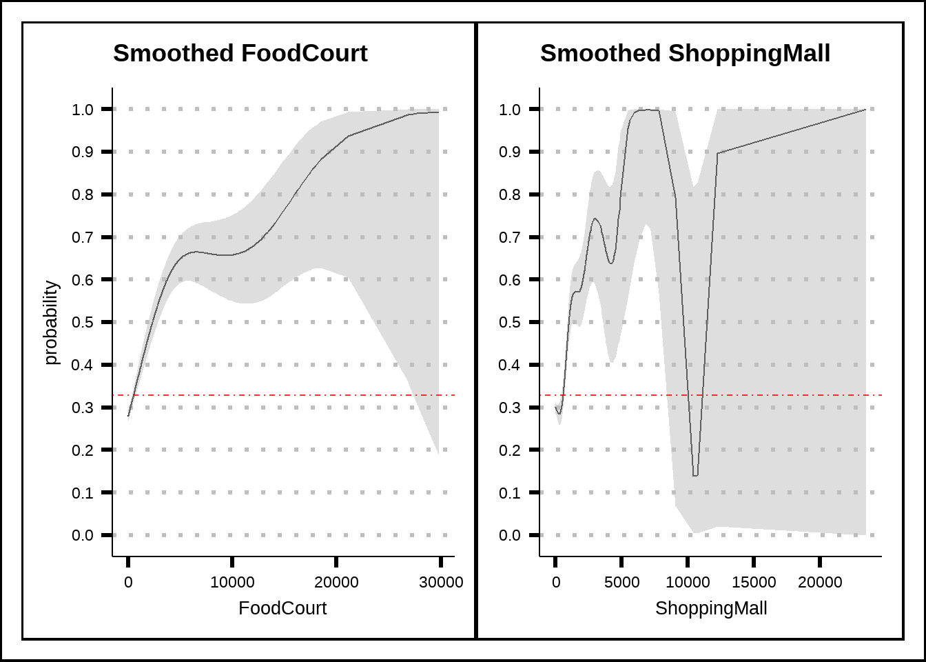
Figure 5.7: General additive model (GAM) plots for FoodCourt and ShoppingMall with smoothed confidence intervals. The red dotted line shows the average probability of the response across the entire training set.
The reverse is true for passengers who spent credits at the FoodCourt or ShoppingMall who instead seem to have been more likely to be transported.
my_smooth_plot(train6 %>% filter(CryoSleep == "False"), "TotalSpent")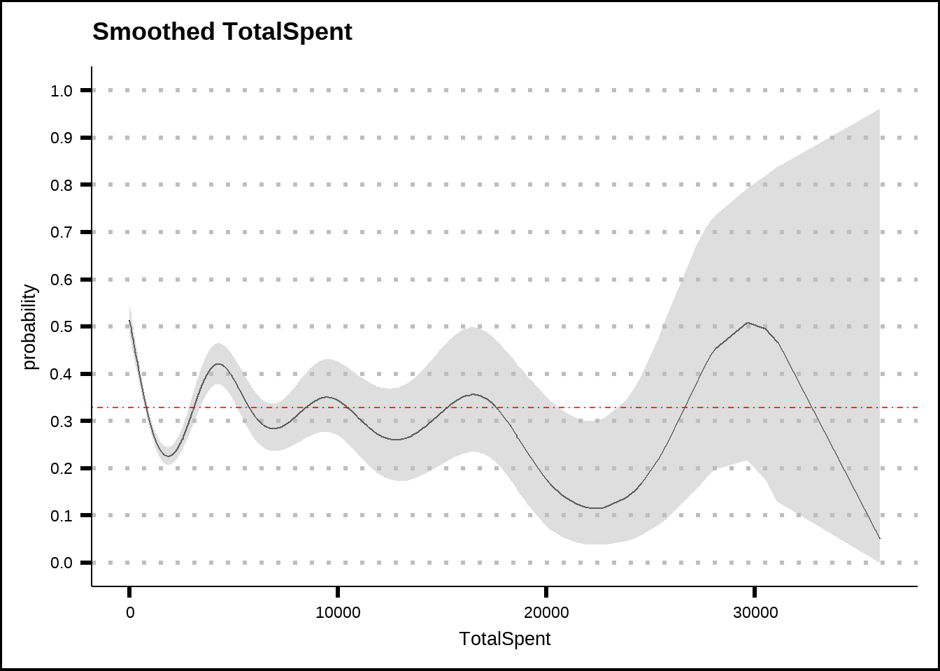
Figure 5.8: General additive model (GAM) plots for TotalSpent with smoothed confidence intervals. The red dotted line shows the average probability of the response across the entire training set.
Our TotalSpent variable seems to smooth out the effects of individual amenities and might reduce model performance. We should be prepared to remove it from our models.
In summary, since our amenity variables have a lot of zero values even when we control for CryoSleep, we want to create binary variables to indicate zero value. The binary variable will be zero when amenities have non-zero values and therefore will drop out of models that use coefficients while it will act like a categorical variable when the value of amenities is zero.
bin_for_zero <- function(df) {
  res <- df %>% mutate(ZeroRoomService = if_else(CryoSleep == "False" & RoomService == 0, 1, 0),
                       ZeroFoodCourt = if_else(CryoSleep == "False" & FoodCourt == 0, 1, 0),
                       ZeroShoppingMall = if_else(CryoSleep == "False" & ShoppingMall == 0, 1, 0),
                       ZeroSpa = if_else(CryoSleep == "False" & Spa == 0, 1, 0),
                       ZeroVRDeck = if_else(CryoSleep == "False" & VRDeck == 0, 1, 0))
  return(res)
}

train6 <- bin_for_zero(train6)
5.4 Correlations
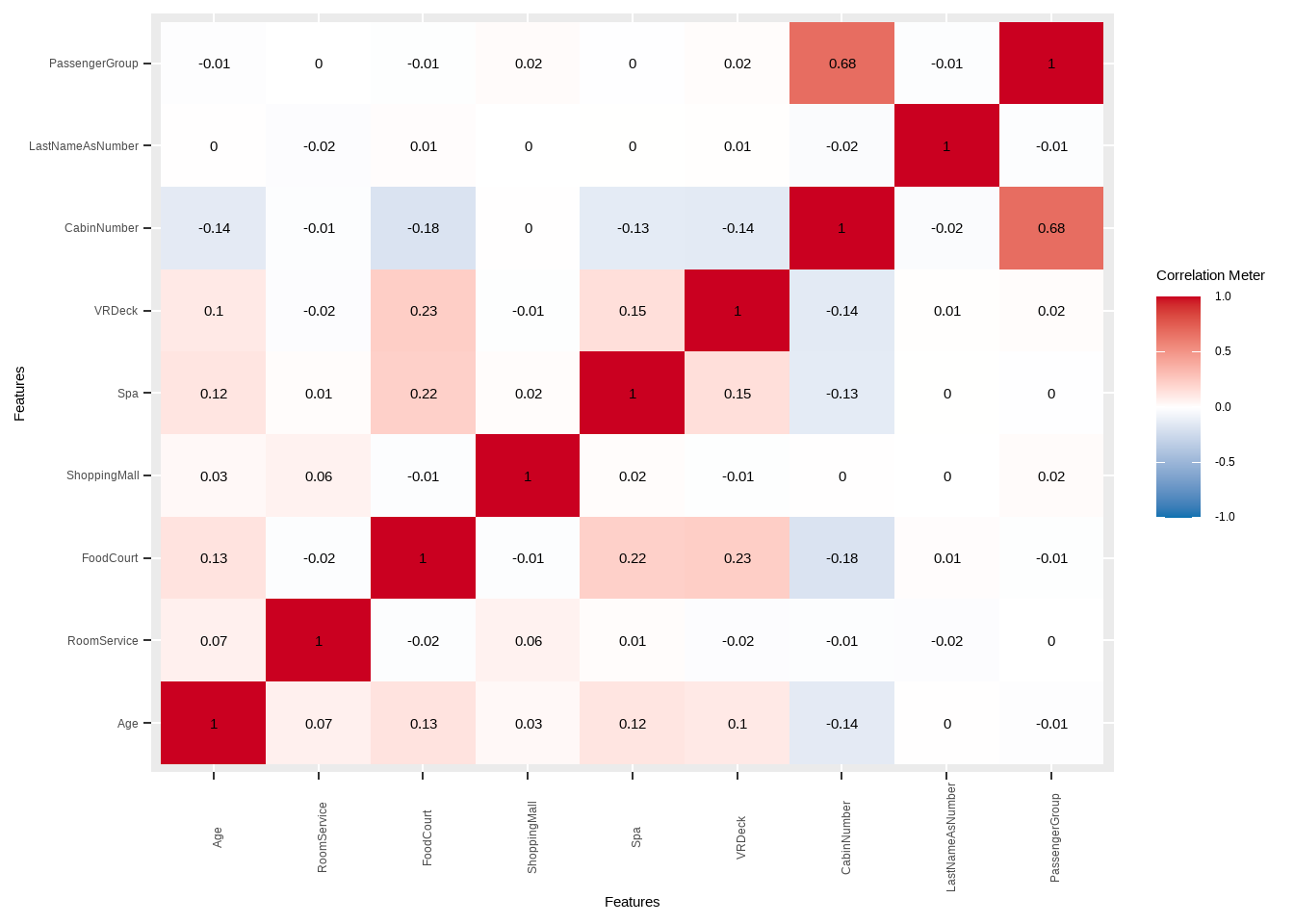
We can see that PassengerGroup and CabinNumber are highly correlated with each other could cause problems with some models that are sensitive to correlated variables. We should consider using one of of each variable and see which one gives better results.
train6 %>%
  select(Age, RoomService, FoodCourt, ShoppingMall, Spa, VRDeck, CabinNumber, LastNameAsNumber, PassengerGroup) %>%
  DataExplorer::plot_correlation(., type = "continuous", theme_config = list(axis.text.x = element_text(angle = 90)))